Plot a course for dataville
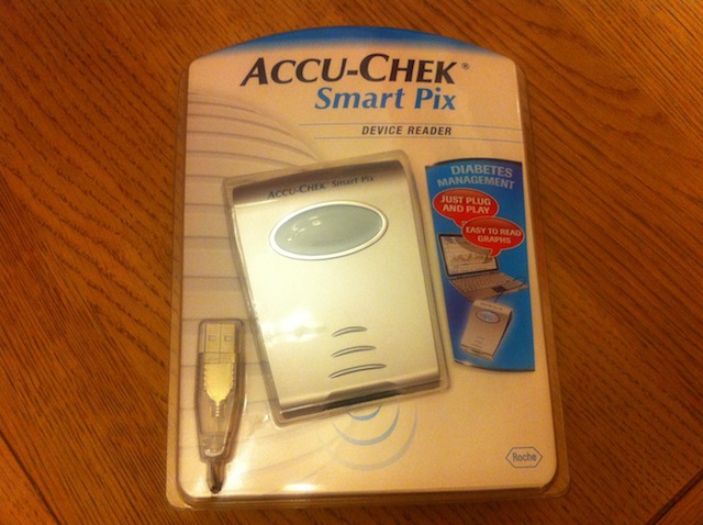
December 21, 2010 | 8:53 pmAfter a false start and a 10 day wait, this showed up in the post this morning…
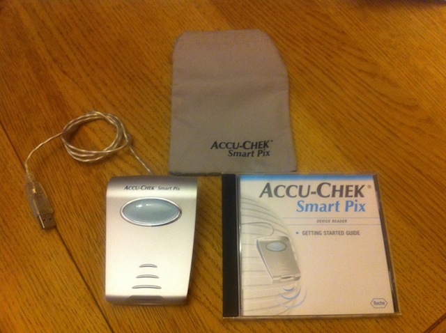
This little widget connects to my Mac (yes, with a bit of giggery pokery, I got it to work on my Mac) and reads the data off Samuel’s Roche Accu-chek Aviva Combo meter. It will then present the data in any number of reports, formatted in all sorts of wonderful different ways.
I’ve gotta say, I’m impressed with the reports it can generate. It was also reasonably easy to set up and very easy to use. And most importantly, it was free. So thank you to Roche for that.
Did I mention it makes graphs! Wanna see a few….? No! Tough!
2 week trend graph
Day graph
Record List
Overview
Metabolic control
Log book
Distribution
Day graph
The old saying of “Lies, damn lies & statistics” comes to mind. Not that I don’t believe the data, but the fact that the data overload could cause you to believe anything.
Having said that, it is interesting to get a perspective on what has happened over say a week or two weeks. And I also like see how is BM level’s change across the week and into the weekend.
I don’t think this data will help too much with dealing with the day to day management when things are going well. But it could help when, like last night, Samuel’s BM’s shot up for no apparent reason. Looking back at the last time this happened might help see how we dealt with it, especially as we are still relatively new to this thing called Diabetes.
Posted by Gareth


previous post: The downside of the curve || next post: Nikki’s revenge